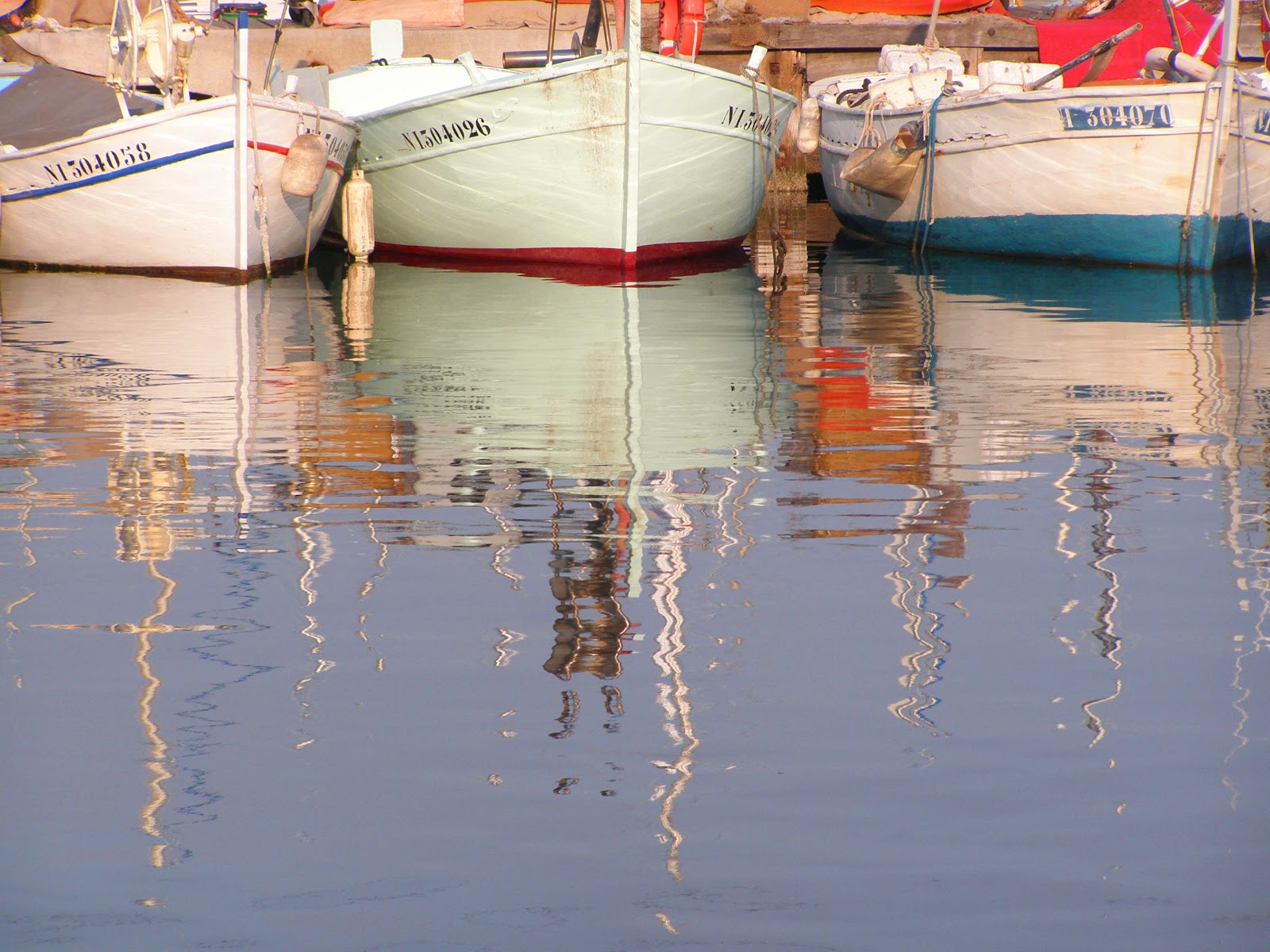
Shapes can also be very dramatic. The best way to stress shape is to simplify and isolate the subject, is to outline against a plain tone. See example :
Next time telling a story.
Saturday, 28 April 2012
12 Simple tips to improve your photography eye! Tip 6 Simplicity & Shape
Never underestimate the power of simplicity. Some of the most powerful images are the most simple. This allows the observer to take in and understand the message of the image. Simple shots are not forgotten, the eye can connect to them really easily and remember them better.
Monday, 23 April 2012
Check out the V&A museum's exhibition British Design 1948-2012 follow this link http://www.vam.ac.uk/content/exhibitions/exhibition-british-design
There is a fantastic section on fashion photography in the 60's and showcases the cult film "Blow Up" by Michelangelo Antonino where Mike Myers based his Austin Powers character from the film. Well worth seeing.
Thursday, 5 April 2012
12 Simple Tips to improve your photography eye!! Tip 5 White Space
Tip 5
White SpaceWhat is white space? It is sometimes more important than the stuff that is in it. It is the space that surrounds your main subject in a photograph. See example :
It is sometimes known as negative space. It allows your eye to travel around the object and gives it a resting space.. Space calls attention to content.
White space is just as much a shape as the main subject together they make up composition. If the space gets filled up it feels oppressive, and a lack of negative space confuses the viewer. It is I feel one of the most important points to deal with when creating an image. The photograph below for example needs the space on the left to compensate for the eye to take in all the fabulous make up and costume of the model.
Next time : Simplicity.
Friday, 23 March 2012
12 Simple tips to improve your photography eye! Tip 4 Colour & Tone
Tip 4
Colour & ToneColour and tone greatly contributes to how you feel about a photograph. We are all conditioned to connect a colour with an abundance of psychological and emotional meaning, and this can vary tremendously between cultural groups and individuals. For example blues and greens create a colder feel, see example below
Whereas if you look at this next photo which is simulaar to the one above I shot at a different time of day with warmer colours such as red it creates a very different feel.
The range of tonal values also effects a photograph. Large dark areas are are associated with strength and mood. Whereas images that are light suggest softness and space.
Try and use colour to help emphasize a subject. For example the image below would not have worked if the little girls dress were in another colour. Again simplicity makes more of a powerful photograph and that rule is applied to colour aswell.
Friday, 9 March 2012
12 Simple Tips to improve your photography EYE! Tip 3 The rule of thirds.
Tip 3
The Rule of ThirdsPhotographs always tends to record too much information. Therefore it is always good to select a simple main theme and then use some tricks to draw the eye towards your chosen subject. There are several ways to help you with this. One as mentioned before is to use lines to encourage your eye into the photograph. Colour and tone is also important we will come onto that next. But there is a golden rule if you can imagine splitting your photograph with three lines across and two lines down as in example provided. This provides a guide to where to place subjects or objects within a frame.
When shooting landscapes if you position the horizon a third or two thirds in the picture this creates balance.
Or if you place an image on one of the intersections where the thirds cross these tend to create strong images.
Next time colour and tone.
Thursday, 23 February 2012
12 Simple Tips to improve your photography EYE! Tip 2 Balance
Tip 2
Balance
Again every picture is subjective yet there is always a balance when looking at a really good image, one that makes the image memorable and pleasing to the eye. Balance dosen't mean that everything in the picture has to be in the centre quite the opposite infact, the eye takes in the camera viewpoint, tone, colour, framing and detail.

For example in this photograph the figure crossing the bridge has been captured just as they pass under the middle of the building creating a strong vertical line however either side of the figure the green colour tone balances the picture, also the red light right at the top of the picture helps the eye travel upward.
When the picture has lots of landscape detail it feels enclosed yet adding more foreground makes such a scale difference giving good depth of field.

Finally sometimes shapes and proportions are objects in their own right, sometimes how they are cropped creates balance.
Next time "The rule of thirds".
Balance
Again every picture is subjective yet there is always a balance when looking at a really good image, one that makes the image memorable and pleasing to the eye. Balance dosen't mean that everything in the picture has to be in the centre quite the opposite infact, the eye takes in the camera viewpoint, tone, colour, framing and detail.
For example in this photograph the figure crossing the bridge has been captured just as they pass under the middle of the building creating a strong vertical line however either side of the figure the green colour tone balances the picture, also the red light right at the top of the picture helps the eye travel upward.

Finally sometimes shapes and proportions are objects in their own right, sometimes how they are cropped creates balance.
Next time "The rule of thirds".
Friday, 10 February 2012
12 Simple Tips to improve your photography EYE !
Everyone can take a good photograph these days especially with all the great cameras on sale you can't really go wrong. Also making a good image is subjective to the individual.
However there are some golden rules that help all the visual elements look right together.
TIP 1
STRUCTURE
First decision is whether you want horizontal or vertical. Your eye scans horizontal pictures best like reading of a book left to right. Using horizontal lines or shapes within creates a strong visual look.
You also have panoramic and square crops. I like the square format it gives a balanced feeling even if the subject is of centre.
Next bog BALANCE.
Subscribe to:
Posts (Atom)